
Patchwork
[ Patchwork Review | Patchwork Accessibility Teardown ]
Patchwork might have made this list by virtue of its tactile pieces, but that’s not what I like most about it. Instead, it’s a wonderful feature that often goes unremarked. Let’s take a look at the Patchwork board:
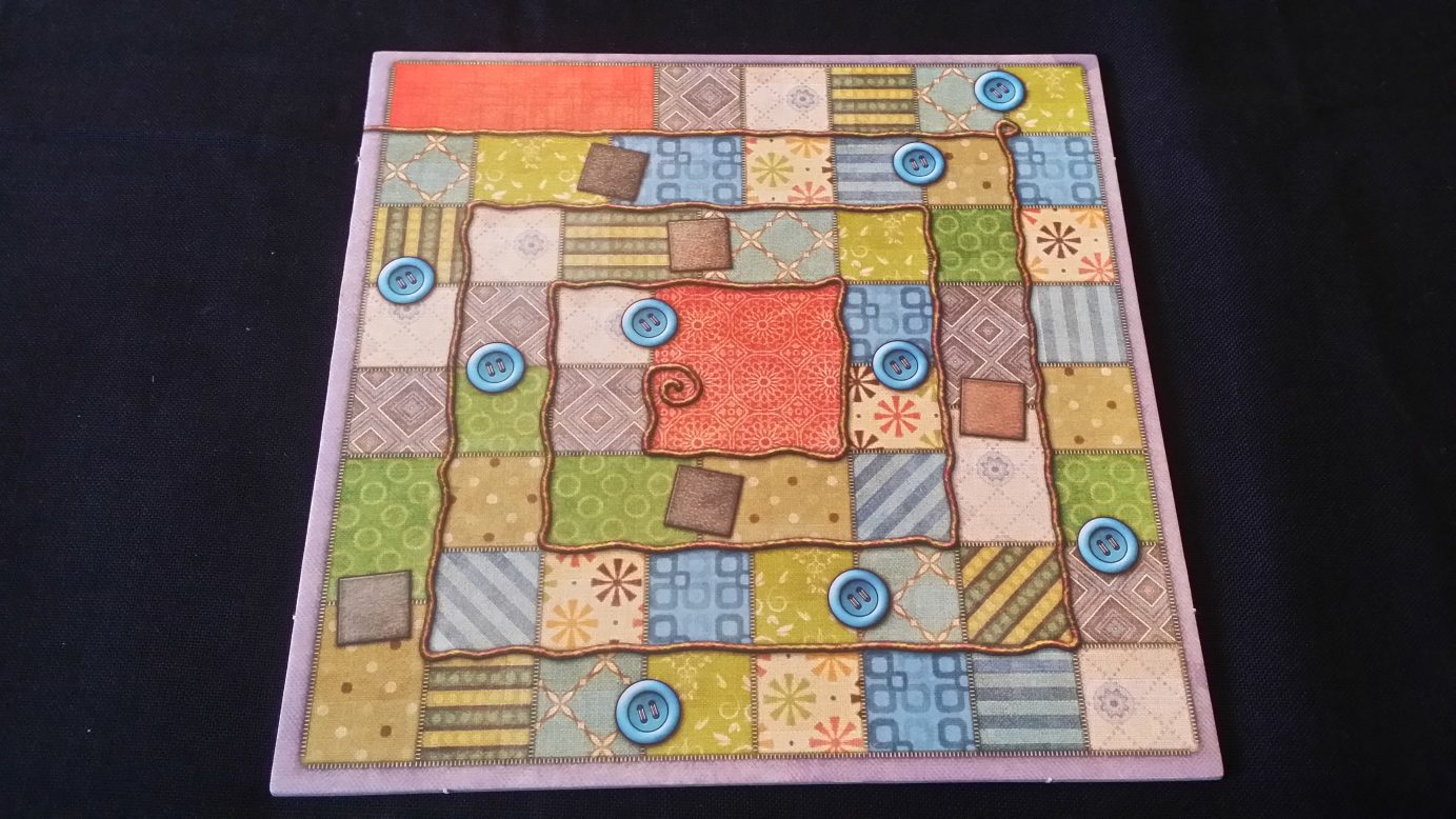
Whether you like the art or not (I don’t) I think we can all reasonably agree this is a hot mess. Squares might be well differentiated from each other but the flow of the board is difficult to make out because in the end it’s not clear where the various rows are. It’s very busy with weird ‘double’ spaces here and there that are bigger than the average but with no special effect.
But if you flip it over…

Good gravy this is great. This is the board I play when I break out the game because it’s just puts less strain on the eyes. It’s also much more visually accessible, eschewing ornamentation for clarity of presentation. Most game boards when you flip them over either have some game related artwork or a plain black backing. Patchwork makes use of that otherwise dead space by providing a board of maximum visual accessibility. It doesn’t make a big thing of it. It just gives you an option that you may not have even realised you wanted.
More games should use the dead-space in their components to permit optional configurations. That might be the difference between a game being playable and it not.
Coup (and the various games in that universe)
[ Coup Review | Coup Accessibility Teardown | The Resistance Review | The Resistance Accessibility Teardown ]
We consider representation to be an accessibility issue. If people don’t see themselves reflected in the characters within a game it might not stop them playing but it certainly doesn’t make them feel like they’re part of the target audience. However, there are risks that come with approaching inclusion in too ham-handed a manner. It’s not just a case of drawing a gender-diverse set of figures and randomly assigning skin-tones. The context in which the art is used also matters. You want to avoid tokenism, but you also want to embrace the rich variety of humanity in your art. So what do you do?

Well, you do what Coup does and make diversity an integral part of the back story because it’s awesome. Globalization in its current form is a new phenomenon but the past was far more diverse than you might think. Renaissance Europe for example was constantly in contact with African traders, Arab intellectualism and awash with the churn of people permitted by the intercontinental travel of the time. Don’t rely on lazy stereotypes or your own hazy recollections of high school history. Do a bit of research and look for a chance to incorporate people that you wouldn’t otherwise.
Make them matter, make them awesome. Give your game a backstory that permits diversity to flourish and your game will be richer for it. More than that, players will see people like them reflected in your art and will be able to see themselves playing your game. And, importantly, they’ll be able to visualise themselves buying it.
Deception: Murder in Hong Kong
[ Deception: Murder in Hong Kong Review | Deception: Murder in Hong Kong Accessibility Teardown ]
Communication games, particularly social deduction games, tend to involve an awful lot of argument at cross purposes. They encourage people to lie, bluff, talk over each other and sow misinformation and misdirection so as to deflect blame and attention. If someone has a communication impairment – whether it be articulation or hearing – it can be very difficult to keep track and more difficult still to make a point over the hubbub of activity.

That’s why it’s great that Deception formally gives every player an uninterrupted chance to make a presentation about the data and what they think it means. The manual says ’30 seconds’ but it also gives permissions to adjust this as needed. As such, while a player with a communication impairment might not be able to get attention during the more rambunctious discussion phase they will get a set interval to put forward their position and have it heard without anyone trying to talk over them or take advantage of communication lapses. Not only does it help in cases of communication impairment but also makes sure those players that lack the hunger for confrontation still get to contribute.
This is something you can (and perhaps should) house rule into any social deduction game but Deception gets kudos for explicitly structuring it into the rules. Really, any game that has a lot of discussion can benefit from having this incorporated into the design.
Santorini & Flash Point
[ Santorini Review | Santorini Accessibility Teardown | Flash Point Review | Flash Point Accessibility Teardown ]
Abstract games tend to require a lot of thought and consideration in order to demonstrate any real mastery. That’s great – it’s what makes them worthwhile as gaming experiences. That can be quite cognitively inaccessible though, and can make it difficult for players to build skill in the first place. One of the criticisms I have of Hive as a game is that it’s only really fun (in my opinion) when you are reasonably well skilled and playing someone else of equivalent skill. Mismatched players are about as much fun as watching your car keys fall into a drain. Given that, why would anyone make the effort?

Santorini though comes with a series of optional cards that give you tremendous flexibility over how even the player ground is. It’s a bit like the unfortunately named handicap in a game of golf – you can give a weaker player a more powerful card, or not take one yourself. You can give them two if you like. You can scale the challenge effectively until you both have a roughly equal chance to win. You get to choose the game you want to have and that is a hugely powerful accessibility aid.
There are quite a few games that offer this kind of explicit or implicit scaffolding of rules, and one of my favourite examples is Flash Point. The rules are modular, permitting you to find the version of the game that is simple enough for everyone to play and complex enough for everyone to enjoy. Modular rules are perhaps the single greatest thing you can do for cognitive accessibility and I’d love to see them being a more regular part of game design. They might make the game more difficult to DEVELOP, but that will be rewarded by opening up a correspondingly greater audience of potential players.
Coloretto
[ Coloretto Review | Coloretto Accessibility Teardown ]
And finally, let’s talk about something all designers should be doing. Colour blindness isn’t a show-stopping condition for those that want to participate in hobbyist gaming. Our charts of colour blindness ratings shows it’s rarely something that actually prevents people having fun. It is though a problem that manifests far more often than it should, even in modern games. The only game I have analysed for this blog where I have said ‘Yeah, I can see how colour blindness might be a difficult problem to work around’ is Sagrada, and even then I’m unconvinced. In 99.99% of cases there really is no excuse for your game being inaccessible to people with colour blindness.
‘But there aren’t colour blind accessible palettes that work for everyone’, people say. That’s true, but there are palettes that go up to fifteen colours that will work for the vast majority of people. That though isn’t actually the solution. The solution is double coding. Whenever you use colour to indicate game state, accompany it with something else. Iconography or art is one of the simplest examples.
As I say, most games do this already to some extent but in cases where icons or art aren’t possible you should just do what Coloretto does. Code information into the texture of the colour. Coloretto is a game all about colours and it manages to be colour blind accessible because of of the texturing it employs.

Seriously, your game has no excuse. If you can’t use icons or art, use textures of the background. No exceptions. No justifications. Just do it.
[ previous page | next page ]